介紹 成品
首先,文字字型的選擇 先用Normalize.css,下載並連結
text-rendering告訴渲染引擎工作時如何優化顯示文字
1
2
3
4
5
6
7
8
9
10
11
12
13
14
15
16
17
18
19
20
21
22
23
24
25
26
*{ margin : 0 ; padding : 0 ; box-sizing : border-box; } html { background-color : #fff ; color : #555 ; font-family : 'Lato' , 'Arial' ,sans-serif; font-weight : 300 ; font-size : 20px ; text-rendering : optimizeLegibility; } .row { max-width : 1140px ; margin :0 auto; }
head區塊
表頭的製作 1 2 3 4 5 6 7 8 <div class="hero-text-box"> <h1>Goodbye junk food. Hello super healthy meals. </h1> <a href="#">I’m hungry</a> <a href="#">Show me more</a> </div>
利用background-image插入圖片後,往上滑會出現上方的空白處
是因為h1的margin(因設置normalize.css)
此時照片也還沒有填滿、置中
調整背景圖位置
讓h1文字置中 透過使用絕對定位,讓文字可以置中
1 2 3 4 5 6 .hero-text-box { position : absolute; width : 1140px ; top : 50% ; left :}
transform: translate(-50%,-50%);
文字放在圖片上使得看不清楚
將背景圖調成深色1 2 background :linear-gradient (0deg ,rgba (0 ,0 ,0 ,.6 ),rgba (0 ,0 ,0 ,.5 )) center center, url (./Omnifood\ Contents/hero.jpg ) no-repeat center center/cover ;
h1文字區的細節調整
調整字的顏色、大小
字母、單字之間的間距1 2 3 4 5 6 7 8 9 10 .hero-text-box h1 {margin : 0 ;color : #fff ;font-size : 240% ;font-weight : 400 ;letter-spacing : 1px ; text-transform : uppercase; word-spacing : 3px ; }
文字區下面的按鈕 html結構是使用<a>來製作連結的點選
1 2 <a class ="btn btn-full" href ="#" > I’m hungry</a > <a class ="btn btn-ghost " href ="#" > Show me more</a >
希望連結與被點選的樣式都是一樣
顏色是到:UI flat color tool ; 要找尋顏色深淺 0 to 255
1 2 3 4 5 6 7 8 9 10 11 12 13 14 15 16 17 18 19 20 .btn :link ,.btn :visited { display : inline-block; text-decoration : none; padding : 10px 15px ;border-radius : 200px ;} .btn-full :link ,.btn-full :visited { background-color : #e67e22 ; color : #fff ; } .btn-ghost :link ,.btn-ghost :visited { border : 1px solid #e67e22 ; color :#e67e22 ; }
按鈕的觸碰與點選 :active 滑鼠按下的樣式; :focus 鍵盤聚焦的樣式 ;:hover 滑鼠滑過
.btn:link,.btn:visited{}
1 2 3 4 5 6 7 8 9 10 11 12 13 14 15 16 17 18 19 20 transition : background-color 0.5s ,border 0.5s ,color 0.5s ; } .btn :hover ,.btn :active { background-color : #cf6d17 ; } .btn-full :hover ,.btn-full :active { border : 1px solid #cf6d17 ; color : #fff ; } .btn-ghost :hover ,.btn-ghost :active { border : 1px solid #cf6d17 ; color :#fff ; }
表頭導覽列的製作 金魚都能懂的這個網頁畫面怎麼切 : 導覽列
header裡面的nav,html架構:
1 2 3 4 5 6 7 8 9 10 11 12 13 14 15 <nav> <div class="row"> <img src="./Omnifood Contents/logo-white.png" alt="Omnifood logo" class="logo"> <ul class="main-nav"> <li> <a href="#">Food delivery</a></li> <li><a href="#">How it works</a></li> <li><a href="#">Our cities</a></li> <li><a href="#">Sign up</a></li> </ul> </div> </nav>
logo
1 2 3 4 5 header .logo {height : 100px ;width : auto;float : left; }
nav
讓nav區靠右
為了讓四個連結區塊可以橫向排列,設定inline-box
針對字型、顏色等做調整
並於連結下方增加線的動畫效果1 2 3 4 5 6 7 8 9 10 11 12 13 14 15 16 17 18 19 20 21 22 23 24 25 26 27 28 29 30 31 32 33 34 35 36 37 38 39 40 .main-nav {float : right;margin-top : 55px ;} .main-nav li {display : inline-block;margin-left : 20px ;} .main-nav li a :link ,.main-nav li a :visited {text-decoration : none;font-weight : 400 ;font-size : 90% ; color : #fff ;text-transform : uppercase;position : relative;padding-bottom : 5px ;} .main-nav a ::after { content : '' ; width : 100% ; position : absolute; border : solid .5px rgba (230 , 126 , 34 ,.6 ); left : 0 ; bottom :0 ; margin-top : 5px ; transform : scale (0 ); transition : 0.5s ; } .main-nav li :hover a ::after ,.main-nav li :active a ::after {transform : scale (1 );}
特色區塊
— 用html符號 –> —HTML Entity List features這部分,使用section標籤來包覆,而其中的不同區塊則使用.row來包覆內容(並用來固定寬度)
這裏的html運用grid來配置欄位
1 2 3 4 5 6 7 8 9 10 11 12 13 14 15 16 17 18 19 20 21 22 23 24 25 26 27 <section class ="section-features" > <div class ="row" > <h2 > Get food fast — not fast food</h2 > <p class ="long-copy" > Hello, we’re Omnifood, your new premium food delivery service. We know you’re always busy. we promise!</p > </div > <div class ="row" > <div class ="col span-1-of-4" > <h3 > Up to 365 days/year</h3 > <p > Never cook again! We really mean that. Our subscript </p > </div > <div class ="col span-1-of-4" > <h3 > Ready in 20 minutes</h3 > <p > You're only twenty minutes away from your delicious ant chefs in each town to ensure that you're 100% happy. </p > </div > <div class ="col span-1-of-4" > <h3 > 100% organic</h3 > <p > All our vegetables are fresh, organic and local. Animals are raised without added hormones or antibiotbetter!</p > </div > <div class ="col span-1-of-4" > <h3 > Order anything</h3 > <p > We don't limit your creativity, which means you cacious meals. It's up to you!</p > </div > </div > </section >
icon 使用ionicon:ionicon
1 <script src="https://unpkg.com/ionicons@5.2.3/dist/ionicons.js" ></script>`
1 2 3 4 5 6 7 8 .section-features .icon-big {display : block; font-size : 350% ; color : #e67e22 ; margin-bottom : 10px ; font-weight : 100 ; }
h2的文字與p 1 2 3 4 5 6 7 8 9 .section-features .long-copy {width : 70% ;margin-left : 15% ;line-height : 145% ; }
欄位col的處理(class=”items”) 1 2 3 4 5 6 7 8 9 10 11 12 13 14 15 16 .section-features h3 { font-weight : 300 ; font-size : 110% ; text-transform : uppercase; margin-bottom : 15px ; } .section-features .items { padding :1% ; } .section-features .items p { line-height : 145% ; font-size :90% ; }
食物照片區
這裏的內容不適用.row來包覆,因為我們希望它的寬度可以站滿橫向的視窗
html結構 1 2 3 4 5 6 7 8 9 10 11 12 13 14 15 16 17 18 19 20 21 22 23 24 25 26 27 28 29 30 31 32 33 34 35 36 37 38 39 40 41 42 43 44 45 46 47 48 49 50 51 52 53 54 <section class ="section-maels" > <ul class ="meals-showcase" > <li > <figure > <img src ="./Omnifood Contents/1.jpg" alt ="Korean bibimbap with egg and vegetables" > </figure > </li > <li > <figure > <img src ="./Omnifood Contents/2.jpg" alt ="Simple italian pizza with cherry tomatoes" > </figure > </li > <li > <figure > <img src ="./Omnifood Contents/3.jpg" alt ="Chicken breast steak with vegetables" > </figure > </li > <li > <figure > <img src ="./Omnifood Contents/4.jpg" alt ="Autumn pumpkin soup" > </figure > </li > </ul > <ul class ="meals-showcase" > <li > <figure > <img src ="./Omnifood Contents/5.jpg" alt ="Paleo beef steak with vegetables" > </figure > </li > <li > <figure > <img src ="./Omnifood Contents/6.jpg" alt ="Healthy baguette with egg and vegetables" > </figure > </li > <li > <figure > <img src ="./Omnifood Contents/7.jpg" alt ="Burger with cheddar and bacon" > </figure > </li > <li > <figure > <img src ="./Omnifood Contents/8.jpg" alt ="Granola with cherries and strawberries" > </figure > </li > </ul > </section >
設定此區塊滿版,並讓他們設定為區塊
讓li,每個設定寬度為25%(4個共100%),並利用float使他們比鄰排列
1 2 3 4 5 6 7 8 9 10 .meals-showcase { list-style : none; display : block; width : 100% ; } .meals-showcase li { float : left; width : 25% ; }
1 2 3 4 5 6 7 8 9 .meals-showcase figure { width : 100% ; } .meals-showcase figure img { width : 100% ; }
去除上圖的空隙vertical-align: middle;
1 2 3 4 5 .meals-showcase figure img { width : 100% ; vertical-align : middle;}
加入文字區在圖片上方 製作圖片被摸到,有圖片縮放的動畫
1 2 3 4 5 6 7 8 9 10 .meals-showcase figure img { width : 100% ; vertical-align : middle; transform : scale (1.15 );transition : transform .5s ;} .meals-showcase figure :hover img { transform : scale (1 ); }
讓圖片有黑色透明效果
在圖片本身img設定透明度,在figure放圖標籤裡設定背景為黑色
1 2 3 4 5 6 7 8 9 10 11 12 13 14 15 16 17 18 .meals-showcase figure { width : 100% ; overflow : hidden; background-color :#000 ; } .meals-showcase figure img { width : 100% ; vertical-align : middle; transform : scale (1.15 );transition : transform .5s ,opicity .5s ;opacity : 0.7 ;} .meals-showcase figure :hover img { transform : scale (1 ); opacity : 1 ; }
訂餐方法介紹 的介面
1 2 3 4 5 6 7 8 9 10 11 12 13 14 15 16 17 18 19 20 21 22 23 24 25 26 27 28 29 30 31 32 33 34 35 36 37 38 <section class ="meal-steps" > <div class ="row" > <h2 > How it works - Simple as 1, 2, 3</h2 > </div > <div class ="row" > <div class ="col span-2-of-4" > <img src ="./Omnifood Contents/app-iPhone.png" alt ="Omnifood-app" class ="app-screen" > </div > <div class ="col span-2-of-4" > <div class ="work-step" > <div > 1</div > <p > Choose the subscription plan that best fits your needs and sign up today.</p > </div > <div class ="work-step" > <div > 2</div > <p > Order your delicious meal using our mobile app or website. Or you can even call us!</p > </div > <div class ="work-step" > <div > 3</div > <p > Enjoy your meal after less than 20 minutes. See you the next time!</p > </div > <a href ="#" > <img src ="./Omnifood Contents/download-app.svg" alt ="apple store button" > </a > <a href ="#" > <img src ="./Omnifood Contents/download-app-android.png" alt ="play store button" > </a > </div > </div > </section >
:first-child
圖片靠右:text-align: right;
右欄文字區 在數字部分:要讓他與文字區能夠排列,使用inline-block,float
1 2 3 4 5 6 7 8 9 10 11 12 .work-step { display : inline-block; margin-bottom : 50px ; } .work-step div { float : left; color :#e67e22 ; border : 2px solid #e67e22 ; border-radius : 50% ; }
讓圓形變圓,增加寬高 1 2 3 4 5 6 .work-step div {height : 55px ; width : 55px ; text-align : center; padding : 5px ; font-size : 150% ;}
按鈕的處理
1 2 3 4 5 .btn-app img { height : 50px ; width : auto; margin-right : 10px ; }
地點資訊
1 2 3 4 5 6 7 8 9 10 11 12 13 14 15 16 17 18 19 20 21 22 23 24 25 26 27 28 29 30 31 32 33 34 35 36 37 38 39 40 41 42 43 44 45 46 47 48 49 50 51 52 53 54 55 56 57 58 59 60 61 62 63 64 65 66 67 68 69 70 71 72 73 74 75 76 <section class ="section-cities" > <div class ="row" > <h2 > We're currently in these cities</h2 > </div > <div class ="row" > <div class ="col span-1-of-4 items" > <img src ="./Omnifood Contents/lisbon-3.jpg" alt ="" > <h3 > Lisbon</h3 > <div class ="city-features" > <ion-icon name ="person" class ="person" > </ion-icon > 1600+ happy eaters </div > <div class ="city-features" > <ion-icon name ="star" class ="star" > </ion-icon > 60+ top chefs </div > <div class ="city-features" > <ion-icon name ="logo-twitter" class ="logo-twitter" > </ion-icon > @omnifood_lx </div > </div > <div class ="col span-1-of-4 items" > <img src ="./Omnifood Contents/san-francisco.jpg" alt ="" > <h3 > San Francisco</h3 > <div class ="city-features" > <ion-icon name ="person" class ="person" > </ion-icon > 3700+ happy eaters </div > <div class ="city-features" > <ion-icon name ="star" class ="star" > </ion-icon > 160+ top chefs </div > <div class ="city-features" > <ion-icon name ="logo-twitter" class ="logo-twitter" > </ion-icon > @omnifood_sf </div > </div > <div class ="col span-1-of-4 items" > <img src ="./Omnifood Contents/berlin.jpg" alt ="" > <h3 > Berlin</h3 > <div class ="city-features" > <ion-icon name ="person" class ="person" > </ion-icon > 2300+ happy eaters </div > <div class ="city-features" > <ion-icon name ="star" class ="star" > </ion-icon > 110+ top chefs </div > <div class ="city-features" > <ion-icon name ="logo-twitter" class ="logo-twitter" > </ion-icon > @omnifood_berlin </div > </div > <div class ="col span-1-of-4 items" > <img src ="./Omnifood Contents/london.jpg" alt ="" > <h3 > London</h3 > <div class ="city-features" > <ion-icon name ="person" class ="person" > </ion-icon > 1200+ happy eaters </div > <div class ="city-features" > <ion-icon name ="star" class ="star" > </ion-icon > 50+ top chefs </div > <div class ="city-features" > <ion-icon name ="logo-twitter" class ="logo-twitter" > </ion-icon > @omnifood_london </div > </div > </section >
1 2 3 4 5 .section-cities img { width : 100% ; vertical-align : middle; margin-bottom : 15px ; }
1 2 3 4 5 6 7 8 9 10 11 12 13 .section-cities .icon-small { color : #e67e22 ; display : inline-block; text-align : center; font-size : 120% ; margin-right : 10px ; line-height : 120% ; vertical-align : middle; margin-top : -5px ; }
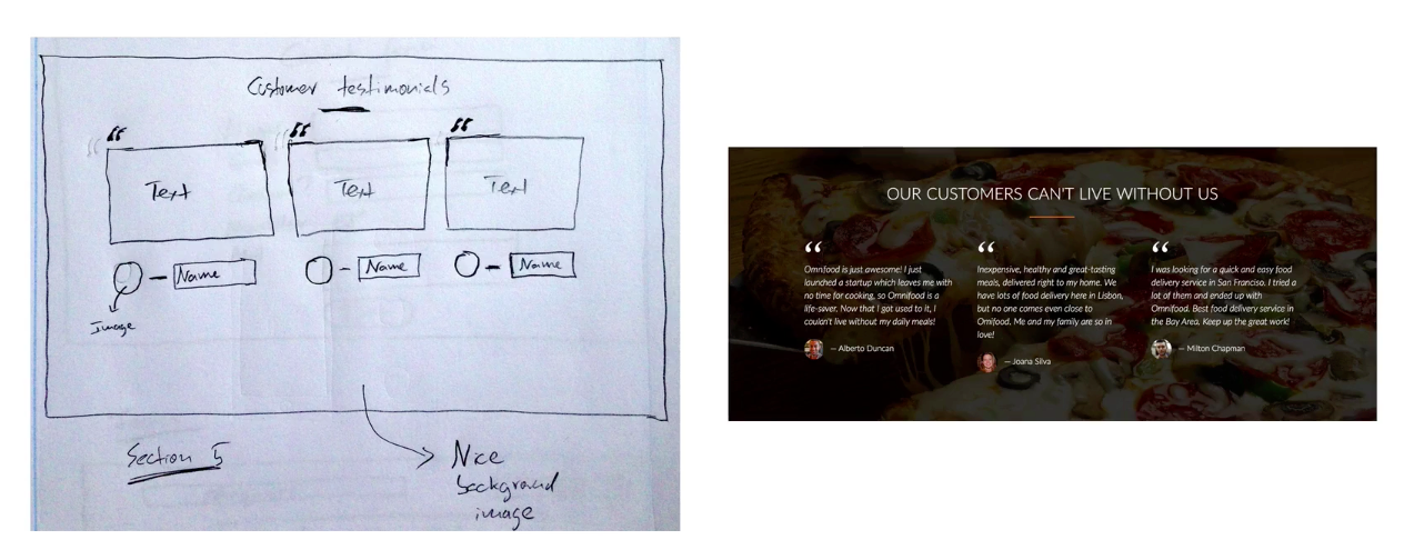
顧客回饋區
區分為三個區塊,一列三欄的方式劃分
用<blockquote>來包顧客的回饋文字
並加入顧客的頭像以及姓名
1 2 3 4 5 6 7 8 9 10 11 12 13 14 15 16 17 18 19 20 21 22 23 24 25 26 27 28 29 30 31 32 33 34 35 36 37 38 39 40 41 42 <section class ="section-testimonials" > <div class ="row" > <h2 > Our customers can't live without us</h2 > </div > <div class ="row" > <div class ="col span-1-of-3" > <blockquote > Omnifood is just awesome! I just launched a startup which leaves me with no time for cooking, so Omnifood is a life-saver. Now that I got used to it, I couldn't live without my daily meals! <cite > <img src ="./Omnifood Contents/customer-1.jpg" alt ="" > Alberto Duncan</cite > </blockquote > </div > <div class ="col span-1-of-3" > <blockquote > Inexpensive, healthy and great-tasting meals, delivered right to my home. We have lots of food delivery here in Lisbon, but no one comes even close to Omifood. Me and my family are so in love! <cite > <img src ="./Omnifood Contents/customer-2.jpg" alt ="" > Joana Silva</cite > </blockquote > </div > <div class ="col span-1-of-3" > <blockquote > I was looking for a quick and easy food delivery service in San Franciso. I tried a lot of them and ended up with Omnifood. Best food delivery service in the Bay Area. Keep up the great work! <cite > <img src ="./Omnifood Contents/customer-3.jpg" alt ="" > Milton Chapman</cite > </blockquote > </div > </div > </section >
1 2 3 4 5 .section-testimonials { background :linear-gradient (0deg ,rgba (0 ,0 ,0 ,.7 ),rgba (0 ,0 ,0 ,.7 )) center center, url (./Omnifood\ Contents/back-customers.jpg )no-repeat center center/cover ; color : #fff ; background-attachment : fixed; }
在.section-testimonials img 增加vertical-align: middle;
增加上面逗點符號 符號表
1 2 3 4 5 6 7 8 9 10 11 .section-testimonials blockquote :before { content :"\201C" ; font-size :500% ; display : block; position : absolute;top : -5px ;left : -5px ;} }
訂購方案介紹區
span標籤的應用
當全部設定寬度100%,會出現問題
頁尾表單的建構
1 2 3 4 5 6 7 8 9 10 11 12 13 14 15 16 17 18 19 20 21 22 23 24 25 26 27 28 29 30 31 32 33 34 35 36 37 38 39 40 41 42 43 44 45 46 47 48 49 50 51 <footer > <div class ="row" > <div class ="col span-1-of-2" > <ul class ="footer-nav" > <li > <a href ="#" > About us</a > </li > <li > <a href ="#" > Blog</a > </li > <li > <a href ="#" > Press</a > </li > <li > <a href ="#" > Android App</a > </li > </ul > </div > <div class ="col span-1-of-2 " > <ul class ="socilmedia-link" > <li > <a href ="#" > <ion-icon name ="logo-facebook" class ="logo-facebook" > </ion-icon > </a > </li > <li > <a href ="#" > <ion-icon name ="logo-twitter" class ="logo-twitte" > </ion-icon > </a > </li > <li > <a href ="#" > <ion-icon name ="logo-google" class ="logo-google" > </ion-icon > </a > </li > <li > <a href ="#" > <ion-icon name ="logo-instagram" class ="logo-instagram" > </ion-icon > </a > </li > </ul > </div > <div class ="row" > <p > copyright © 2020 by Omnifood. All right reserved. </p > </div > </div > </footer >
使用float來使物件放置左右側
footer-nav li使用inline-block
1 2 3 4 5 6 7 8 9 10 11 12 13 14 15 16 17 footer { background-color : #333 ; padding : 50px ; font-size : 80% ; } footer .footer-nav { list-style : none; float : left; } .socilmedia-link { list-style : none; float : right; } .footer-nav li ,.socilmedia-link li { display : inline-block; margin-right : 20px ; }
連結顏色調整 1 2 3 4 5 6 7 8 9 10 11 12 13 14 15 16 17 18 19 20 21 22 .footer-nav li :last-child ,.socilmedia-link li :last-child { margin-right : 0px ; } .footer-nav li a :link ,.footer-nav li a :visited , .socilmedia-link li a :link ,.socilmedia-link li a :visited { text-decoration : none; border : none; color : #888 ; transition : color .3s ; } .footer-nav li a :hover ,.footer-nav li a :active { color : #ddd ; } .socilmedia-link li a :link ,.socilmedia-link li a :visited { font-size : 160% ; }
1 2 3 4 5 6 7 8 9 10 11 12 13 14 15 16 17 18 19 20 21 22 23 24 25 26 footer p { color :#888 ; text-align : center; margin-top : 20px ; } .logo-instagram ,.logo-google ,.logo-twitte ,.logo-facebook {transition : color .3s ;} .logo-instagram :hover { color : #517fa4 ; } .logo-google :hover { color : #dd4b39 ; } .logo-twitte :hover { color : #00aced ; } .logo-facebook :hover { color : #3b5998 ; }
補充 background與background-imge之差別1 2 3 4 5 6 7 8 9 10 background属性是整體設置的,background image是background的属性之一,background的屬性包括 background-color background-image background-repeat background-attachment background-position, 你看不到圖片是因为設置錯,不能加no-repeat屬性,應改為: background-image:url("some.jpg"); background-repeat:no-repeat;分開寫 [background和background-image什么区别](https://bbs.csdn.net/topics/310167508)
1 2 3 4 5 6 7 8 9 10 .header {background-image :url (./Omnifood\ Contents/hero.jpg ) ;background-size : cover;background-position : center;} .header {background : url (./Omnifood\ Contents/hero.jpg ) no-repeat center center/cover;}
文字框置中(區塊(div)的垂直置中)
pjchender
Position + Transform(常用):先利用 position: absolute 把 top: 50% 設在 50%;接著再透過 transform: translateY(-50%) 把超過的部分修正回來,達到垂直置中。
1 2 3 4 5 6 7 8 9 .hero-text-box { display : flex; width : 1140px ; height : 100% ; flex-direction : column; align-items : center; justify-content : center; }
參考:pjchender
Button versus Link
1
2
3
4
From a semantics and accessibility viewpoint: Links ``(<a>) ``are for "going someplace" such as "jumping to a different section of a page, going to another URL, etc. Whereas Buttons ``<button> ``are for "doing something" such as a function on the page to expand/collapse a menu, submit a form or etc.
grid參考資料Spectacularly Easy Responsive Design 關於 Grid Layout 的使用姿勢 六角學院 - Bootstrap Grid System 原理介紹
margin 與 paggimg製作steps區塊時,因設定section的margin距離
1
2
3
.meal-steps { background : #f4f4f4 ; }
這裏應該改為padding1 2 3 4 section { padding : 80px 0 ; }
練習後的小心得: 1.在html建構會使用.row