
scss 檔案的建立
所建立的各分檔,個別會負責不同的區塊,並透過@import放入主要的sass檔
- main.scss 引入其他分檔

- abstracts
- /_variables.scss:設定常用的變數,如:顏色、字體大小
- /_mixin.scss:設定某些區段中,重複用到的樣式,並於該區段要使用的時候引用
- base
- /_base.scss:為設定大框架,如html、body、container,等主幹的大小、字型的設定
- components:放置部分功能元件
- /_button.scss:按鈕的設定
- /_heading.scss:標題
- /_logo.scss
- /_dropdown.scss
- layout (設計網頁版面配置(Layout))
- /_header.scss
- /_navigation.scss
- /_products.scss
- /_slidshow.scss
- /_footer.scss
- pages 通常是用來放置其他分頁(網頁內會連結到其他相關分頁)
- venders 放置外部套件

(1)基礎設置
(1.1)Grid 練習
_base.scss
- 總共要設置10欄
- 列的則是設置4區塊
- 並設置每個區塊都有1.6rem的gap
1
2
3
4
5
6
7.container{
display: grid;
grid-template-columns:minmax(6rem,1fr) repeat(8,minmax(min-content,16 rem)) minmax(6rem,1fr);//10欄
grid-template-rows: repeat(4,min-content);
grid-row-gap:1.6rem ;
}

minmax(min, max)minmax(6rem,1fr):設定格線最小6rem,最大1fr
fr 單位就是為了格線布局而生,fraction,中文意思是分數,當使用在網格軌道上時,可以直接想像成 “我的這個空位要佔有總 fr 數量的幾等份”repeat(8,minmax(min-content,16rem)):重複8個,最小:min-content;最大16rem- repeat() 重複網格線及間距
- max-content/min-content 最小內容尺寸/最大內容尺寸
- max-content:給予網格區域所需的最大尺寸空間,內容盡可能避免折行。
- min-content:給予網格區域所需的最小尺寸空間,內容盡可能的折行,但不會溢出邊界。
- max-content/min-content 最小內容尺寸/最大內容尺寸
- repeat() 重複網格線及間距
[Day19] grid-template 屬性之 rows/columns
Min & Max Content Sizing in CSS Grid — 1/3 Flexibility
CSS Layout很難?用這招30秒就讓你輕鬆生出網頁版面!
(1.2)常用變數
_variable.scssmap與function的搭配使用- 設定不同的顏色,並設置函式,以利後續使用
1 | $colors:( |
(2)layout/_header.scss
header的版面
grid-column: 1/-1; (1/11) grid-row: 1/2;表示所佔的區隔
- 而在header這區,在設置grid劃分區塊
- 有9欄
- 列設置3區塊
1
2
3
4
5
6
7
8.header{
grid-column: 1/-1; //1/11
grid-row: 1/2;
display: grid;
grid-template-columns: 1fr repeat(7,minmax(min-content,16rem)) 1fr;
grid-template-rows: repeat(3,min-content);
grid-gap: 2rem;
}
grid-column: 1/-1; //1/11 ; grid-row: 1/2;What’s the difference between grid-column value 1/1 and 1/2?
(3)logo的大小設置
_logo.scss
- 注意:設立所設定的欄和列的區塊,是在header設置的grid底下

1 | .logo{ |
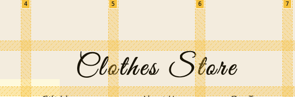
(4)heading
- 標題的位置一樣利用grid來設定
- 在文字的字體、大小、間距進行調整
_heading.scss1
2
3
4
5
6
7
8
9
10
11.heading{
grid-column: 4/7;
grid-row: 2/3;
text-align: center;
&-text{
font-family: 'Great Vibes',cursive;
font-size: size(xl)*2; //結果為6rem
font-weight: lighter;
letter-spacing: 0.5rem;
}
}
(5)heading中的navigation
layout/_navigation.scss
.first-nav為放置右上角.second-nav為放置下方,中間的位置1
2
3
4
5
6
7
8
9
10
11
12
13
14
15
16
17
.first-nav{
//放在最後三欄
grid-column: 7/10;
grid-row: 1/2;
@include navigation;
}
.second-nav{
grid-column: 3/8;
grid-row: 3/4;
@include navigation;
}
.dropdown{
display: none;
}

- @mixin,創造navigstion共用樣式
- 使navigation的li-list可以橫向分散排列
- 設定hover效果,使游標摸到顏色變淺
lighten()1
2
3
4
5
6
7
8
9
10
11
12
13
14
15
16
17
18
19
20
21
22
23
24//.first-nav-list
@mixin navigation{
&-list{
display: flex;
justify-content: space-around;
align-items: center;
height: 100%;
}
&-item{
list-style: none;
}
&-link{
color: color(primary);
text-decoration: none;
font-size: size(sm);
transition: all .3s;
&:hover{
color: lighten(color(primary),40%);
}
}
}
(6)下拉選項:dropdown list的箭頭符號
components/_dropdown.scss
font-family: 'Font Awesome 5 Free':把icon當作字體使用
使用 fontAwesome 動態加入連結 icon
1 | .dropdown-li{ |

製作下拉式選單的三角形
- 先利用border製作出上、下、左、右的三角
1
2
3
4
5
6
7
8
9
10
11
12
13
14.dropdown{
&::before{
content: '';
display: block;
position: absolute;
top: -1.5rem;
left: 7.3rem;
border-top: 15px solid red;
border-right: 15px solid green;
border-bottom: 15px solid orange;
border-left: 15px solid blue;
}
}
- 先利用border製作出上、下、左、右的三角
調整上方各色的三角形,並留下要保留的一個三角形
1 | &::before{ |

right: -2.8rem;:條整位置對齊正方形listborder-bottom: 15px solid darken(color(tertiary),5%);:修改三角形的顏色,使整體為灰色
1 | .dropdown{ |

- hover使下拉選單消失\出現
- 建立游標摸到
.dropdown-li,會顯示下拉選單 visibility、opacity1
2
3
4
5
6
7
8
9
10
11
12
13.dropdown-li{
&:hover .dropdown{
visibility: visible;
opacity: 1;
}
}
.dropdown{
visibility: hidden;
opacity: 0;
transition: opicity .3s;
}
- 建立游標摸到


使slideshow可以跳轉(如幻燈片效果)
使用
@keyframes做出動畫位置Animation Duration(動畫整個完成一次的時間): (fade-in + visible) × images = duration.
- 假設你要讓圖片花1秒fade-in,再讓他顯示1秒。而你共有3張圖片,所以總共所需時間為6秒。
Animation Delay:(fade-in + visible) × (ordinal position − 1) = delay.
Keyframes: 100 ÷ animation duration = percentage for 1 second.(100/20=5%),5%為1秒,所以4秒大約是20%的位置
1
2
3
4
5
6
7
8
9
10
11
12
13
14
15
16
17
18
19
20
21
22
23
24
25
26
27
28
29
30
31
32
33
34
35
36
37
38
39
40
41
42
43
44
45
46.slideshow{
&-slide{
//使圖片、文字都放在同一個位置
position: absolute;
top: 0;
left: 0;
width: inherit;
height: inherit;//預設先讓slide消失
visibility: hidden;
opacity: 0;
animation: slideshow 20s linear infinite ;
}
}
@keyframes slideshow{
//主要是0~20時圖片顯示,之後都消失,讓其他圖片得宜顯示
//0~2%創造fade的效果
0%{
visibility: hidden;
opacity: 0;
};
2%{
visibility: visible;
opacity: 1;
}
//2%~18% slide要顯示
18%{
visibility: visible;
opacity: 1;
}
//18~20要消失
20%{
visibility: hidden;
opacity: 0;
}
100%{
visibility: hidden;
opacity: 0;
}
}Simplest CSS Slideshow
CSS3 Keyframes Animation
[筆記] CSS動畫Animation — @keyframes
完整解析 CSS 動畫 ( CSS Animation )設置延遲時間(4秒),使每張圖片呈現(css的撰寫方式)
:nth-child()選擇第幾張圖片1
2
3
4
5
6
7
8
9
10
11
12
13
14
15
16/*設置延遲時間,讓每張slide呈現4秒替換*/
.slideshow-slide:nth-child(1){
animation-delay: 0s;
}
.slideshow-slide:nth-child(2){
animation-delay: 4s;
}
.slideshow-slide:nth-child(3){
animation-delay: 8s;
}
.slideshow-slide:nth-child(4){
animation-delay: 12s;
}
.slideshow-slide:nth-child(5){
animation-delay: 16s;
}
- 將上方轉化為
@each的寫法- 先創造一個列表
$animlist,在each迴圈時要但進去的項目 - 在each迴圈中
.slideshow-slide:nth-child放入slide of number(取得列表中第一個值),後面接著寫下要執行的動作animation-delay: nth($item,2);
- 先創造一個列表
1 | ///改寫為=>$animlist:第幾個 延遲秒數, |
Sass Tutorials #9 - Nth Function In Lists
產品區下方see more按鈕
- html part
- 有三個
arrow-line,於後續在scss中會運用此三個div製作箭頭符號1
2
3
4
5
6
7
8
9
10
11
12
13
14<div class="products-btn">
<a href="#" class="btn">
<div class="btn-bg">
<div class="arrow">
<div class="arrow-line arrow-line-1"></div>
<div class="arrow-line arrow-line-2"></div>
<div class="arrow-line arrow-line-3"></div>
</div>
</div>
<span class="btn-text">
See More
</span>
</a>
</div>
- 有三個
- 創造arrow
transform: rotateZ:Z軸 (使其斜向旋轉45度)1
2
3
4
5
6
7
8
9
10
11
12
13
14
15
16
17
18&-line {
height: .2rem;
background-color: color(secondary);
position: absolute;
}
&-line-2 {
width: 1rem;
//透過旋轉線2,線3使其成為交叉
transform: rotateZ(45deg);
}
&-line-3 {
width: 1rem;
transform: rotateZ(-45deg);
}
transform-origin去設定物件變形的起始點
1 | &-line { |

- 增加橫向直線
1 | &-line-1{ |

- 設置動畫,透過摸到箭頭,會延展
- bg的的寬度進行延展
1 |
|

使see more 出現
- 先修改see more的顏色
- 即便改變顏色,還是會被bg覆蓋,所以要調整z-index
1
2
3
4
5
6
7
8
9
10
11
12
13
14
15
16
17.btn{
&:hover .btn-text{
color: color(secondary);
}
&-text{
font-size: size(xs);
text-transform: uppercase;
color: color(primary);
z-index: 10;
}
}
將箭頭向右移動,並呈現完整箭頭符號
- 設定
.arrow右移,並讓line-1得宜呈現並延展1
2
3
4
5
6
7
8
9
10
11
12
13
14
15
16
17
18
19
20
21
22
23
24.btn{
&:hover .arrow{
transform: translateX(1rem);
}
&:hover .arrow-line-1{
width: 2rem;
}
.arrow{
@include flexPosition;
transition: transform .2s ;
&-line-1{
width: 0;
transform: translateX(-0.7rem);
transition: width .2s ;
}
}
}
- 設定
表尾區塊

(1)footer區塊的樣式
layout/_footer.scss
- footer有三區,中間是表單,左右邊分別為資訊連結
1
2
3
4
5
6
7
8
9.footer{
grid-column: 1/-1;
grid-row: 4/5;
@include flexPosition(space-around);
padding:5rem 0 ;
border-top: .1rem solid color(primary);
}

- 透過
@mixin一次修改2區的條例項目(mixin_scss)- 其中包含文字大小、樣式、hover效果
1
2
3
4
5
6
7
8
9
10
11
12
13
14
15
16
17
18
19
20@mixin footerList {
&-heading{
font-size: size(lg);
color:color(primary);
}
&-item{
list-style: none;
margin: 1rem 0;
}
&-link{
font-size: size(xs);
text-decoration: none;
color: lighten(color(primary),15%);
transition: color .2s ;
&:hover{
color:lighten(color(primary),35%)
}
}
}
- 其中包含文字大小、樣式、hover效果
(2)社群icon
1 |
|

border-radius: 100%;調整為圓形外框- a標籤的前放為i的圖示,所以flex的設置,是針對
social-icons-lik
- 利用
@each來套入icon的顏色
1 | &-link{ |
- 轉為css
1
2
3
4
5
6
7
8
9
10
11
12
13
14
15
16
17
18
19
20
21
22
23.social-icons-item:nth-child(1) .social-icons-link {
color: #3b5998;
border: 0.1rem solid #3b5998; }
.social-icons-item:nth-child(2) .social-icons-link {
color: #b31217;
border: 0.1rem solid #b31217; }
.social-icons-item:nth-child(3) .social-icons-link {
color: #dc4e41;
border: 0.1rem solid #dc4e41; }
.social-icons-item:nth-child(4) .social-icons-link {
color: #55acee;
border: 0.1rem solid #55acee; }
.social-icons-item:nth-child(5) .social-icons-link {
color: #517fa4;
border: 0.1rem solid #517fa4; }
.social-icons-item:nth-child(6) .social-icons-link {
color: #0077b5;
border: 0.1rem solid #0077b5; }
