<h2>Get food fast — not fast food</h2> <pclass="long-copy">Hello, we’re Omnifood, your new premium food delivery service. We know you’re always busy. we promise!</p> </div> <divclass="row"> <!-- 第二區塊:features,這裏要開始應用grid --> <divclass="col span-1-of-4"> <h3>Up to 365 days/year</h3> <p>Never cook again! We really mean that. Our subscript </p> </div> <divclass="col span-1-of-4"> <h3>Ready in 20 minutes</h3> <p>You're only twenty minutes away from your delicious ant chefs in each town to ensure that you're 100% happy. </p> </div> <divclass="col span-1-of-4"> <h3>100% organic</h3> <p>All our vegetables are fresh, organic and local. Animals are raised without added hormones or antibiotbetter!</p> </div> <divclass="col span-1-of-4"> <h3>Order anything</h3> <p>We don't limit your creativity, which means you cacious meals. It's up to you!</p> </div> </div> </section>
<sectionclass="meal-steps"> <!-- 在row裡面,放一個h2標題,在增加一個row的div,使用grid兩欄的class --> <divclass="row"> <h2>How it works - Simple as 1, 2, 3</h2>
</div> <divclass="row"> <!-- 左欄 --> <divclass="col span-2-of-4"> <imgsrc="./Omnifood Contents/app-iPhone.png"alt="Omnifood-app"class="app-screen"> </div> <!-------- 右欄 ------> <divclass="col span-2-of-4"> <divclass="work-step"> <div>1</div> <p>Choose the subscription plan that best fits your needs and sign up today.</p> </div> <divclass="work-step"> <div>2</div> <p>Order your delicious meal using our mobile app or website. Or you can even call us!</p> </div> <divclass="work-step"> <div>3</div> <p>Enjoy your meal after less than 20 minutes. See you the next time!</p> </div> <!------- 與步驟同一欄,下載的按鈕使用<a> ------>
<ahref="#"><imgsrc="./Omnifood Contents/download-app.svg"alt="apple store button"></a> <ahref="#"><imgsrc="./Omnifood Contents/download-app-android.png"alt="play store button"></a>
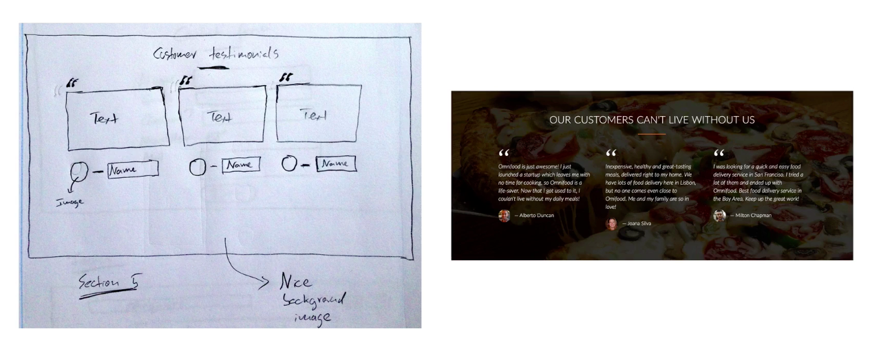
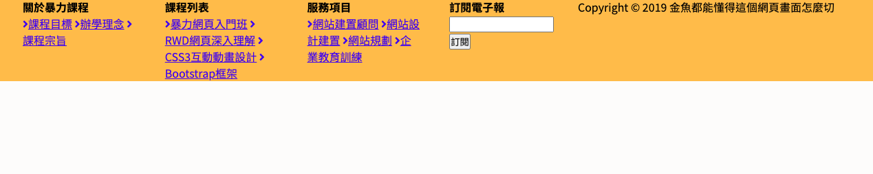
<sectionclass="section-testimonials"> <divclass="row"> <h2>Our customers can't live without us</h2> </div> <divclass="row"> <divclass="col span-1-of-3">
<blockquote> Omnifood is just awesome! I just launched a startup which leaves me with no time for cooking, so Omnifood is a life-saver. Now that I got used to it, I couldn't live without my daily meals! <cite><imgsrc="./Omnifood Contents/customer-1.jpg"alt="">Alberto Duncan</cite> </blockquote>
</div> <divclass="col span-1-of-3">
<blockquote> Inexpensive, healthy and great-tasting meals, delivered right to my home. We have lots of food delivery here in Lisbon, but no one comes even close to Omifood. Me and my family are so in love! <cite><imgsrc="./Omnifood Contents/customer-2.jpg"alt="">Joana Silva</cite> </blockquote>
</div>
<divclass="col span-1-of-3">
<blockquote> I was looking for a quick and easy food delivery service in San Franciso. I tried a lot of them and ended up with Omnifood. Best food delivery service in the Bay Area. Keep up the great work! <cite><imgsrc="./Omnifood Contents/customer-3.jpg"alt="">Milton Chapman</cite> </blockquote>
</div>
</div>
</section>
先做背景的處理
1
2
3
4
5
.section-testimonials {
  background:linear-gradient(0deg,rgba(0,0,0,.7),rgba(0,0,0,.7)) center center, url(./Omnifood\ Contents/back-customers.jpg)no-repeat center center/cover ;
  color: #fff;
  background-attachment: fixed;
}
From a semantics and accessibility viewpoint:
Links ``(<a>) ``are for "going someplace" such as "jumping to a different section of a page, going to another URL, etc.
Whereas
Buttons ``<button> ``are for "doing something" such as a function on the page to expand/collapse a menu, submit a form or etc.
<imgsrc="https://picsum.photos/500/500?random=6"> <p> "Lorem ipsum dolor sit amet, consectetur adipiscing elit, sed do eiusmod tempor incididunt ut labore et dolore magna aliqua. Ut enim ad minim veniam, quis nostrud exercitation ullamco laboris nisi ut aliquip ex ea commodo consequat. Duis aute irure dolor in reprehenderit in voluptate velit esse cillum dolore eu fugiat nulla pariatur.
<div class="container"> <img src="https://picsum.photos/500/400?random=1" alt=""> <p>Dr. Norman Borease wheat yields - part of his life-long war on hunger.</p> </div> <div class="list"> <h2>Here's a time line of Dr. Borlaug's life:</h2> <ul> li*16-- </ul> <p>"Borlaug's life and achievement are testimony to the far-reaching contribution that one man's towering intellect, persistence and scientific vision can make to human peace and progress." <br> -- Indian Prime Minister Manmohan Singh</p> <h3><strong>If you have time, you should read more about this incredible human being on his a <a href="https://en.wikipedia.org/wiki/Norman_Borlaug">Wikipedia entry</a> .</strong></h3>