let a = newAnimal('Jack'); console.log(a.name); // Jack a.name = 'Tom';
// index.ts(9,13): error TS2341: Property 'name' is private and only accessible within class 'Animal'. // index.ts(10,1): error TS2341: Property 'name' is private and only accessible within class 'Animal'.
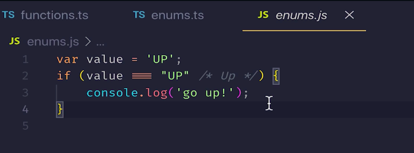
// 字符串列舉 enumDirection { Up = 'UP', Down = 'DOWN', Left = 'LEFT', Right = 'RIGHT', } const value = 'UP' if (value === Direction.Up) { console.log('go up!') }
範例三
常數列舉
編譯後的邏輯變少了
使用常數列舉會內連列舉的用法並且不會將設定的列舉編譯成 JS 程式碼
1 2 3 4 5 6 7 8 9 10
constenumDirection { Up = 'UP', Down = 'DOWN', Left = 'LEFT', Right = 'RIGHT', } const value = 'UP' if (value === Direction.Up) { console.log('go up!') }
泛型 Generics
要解決什麼問題
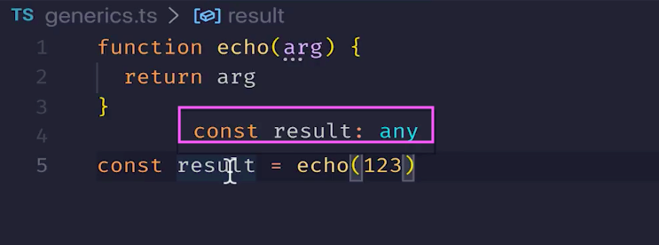
建立函式 echo 參數為 arg ,接著宣告變數傳入參數
但其中的型別沒有設定
傳入和返回的型別無法統一
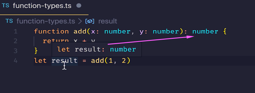
1
2
3
4
5
functionecho(arg) { return arg } const result = echo(123) // 這時候我們發現了一個問題,我们傳入了數字,但是返回了 any
//此時如果呼叫 loggingIdentity 的時候,傳入的 arg 不包含 length,那麼在編譯階段就會報錯了 echoWithLength(7); // index.ts(10,17): error TS2345: Argument of type '7' is not assignable to parameter of type 'Lengthwise'
// Type 'Boolean' is not assignable to type 'boolean'. // 'boolean' is a primitive, but 'Boolean' is a wrapper object. Prefer using 'boolean' when possible.
遇到ref={ item: "changed"};,會直接覆蓋地址(有點類似pass by value)
這並不是直接更改物件特性
最後,來說說 JavaScript 屬於?
看了多篇文章,實在也是有點混亂,該認為三種形式都有呢?還是就是Pass by sharing、Pass by reference呢? 那例外情形又該如何解釋?
所以這邊的結尾,直接引用Kuro、Huli老師文章的資訊,供給大家參考。
從Kuro Hsu 的文章、書 提及認為 JavaScript 應該更屬於 Pass by sharing 的形式。
JavaScript 不屬於單純的傳值或傳址。
參考 ECMA-262-3 in detail. Chapter 8. Evaluation strategy
Regardless of usage concept of reference in this case, this strategy should not be confused with the “call by reference” discussed above. The value of the argument is not a direct alias, but the copy of the address. 由於在 JavaScript 的物件類型是可變的 (mutable),當物件更新時,會影響到所有引用這個物件的變數與其副本,修改時會變動到原本的參考,但當賦與新值時,會產生新的實體參考。
另外在 Huli 的文章中:
依據細分程度的不同,下面幾句話都是正確的: JavaScript 裡面只有 pass by value JavaScript 的 primitive type 是 pass by value,object 是 pass by sharing
最終來個綜合練習:
相信在最後的這個練習,可以更清楚,pass by value,pass by reference,pass by sharing